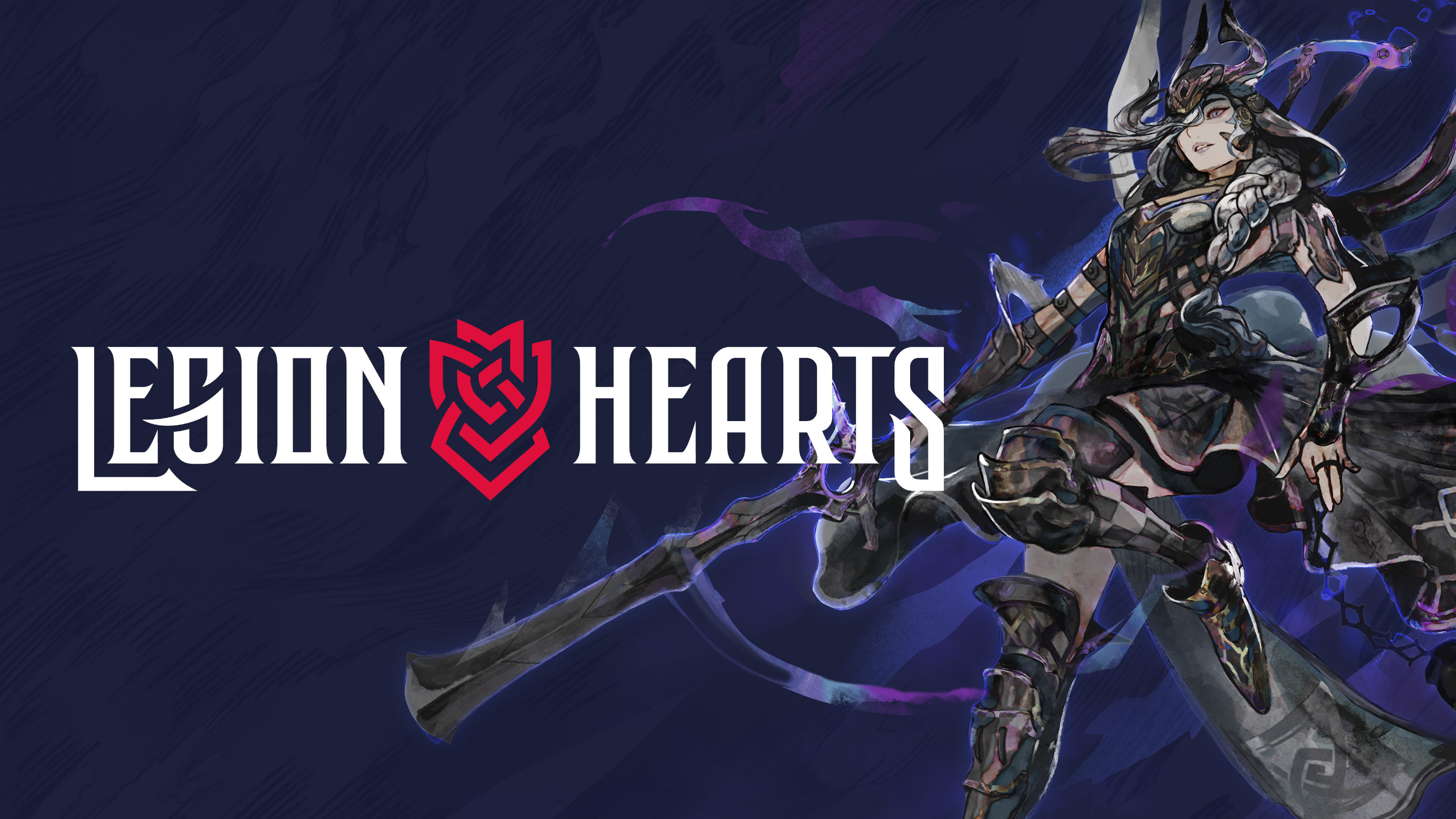
Legion Hearts
Making the Box Art
Thoughts, sketches and alternate color variations for the box art of our first story chapter. All artwork done by Max Berthelot.
Chapter Covers
Every chapter in Legion Hearts will have its very own cover, depicting the protagonist (and future Valkyrie) of that chapter. Chapter 1 is set in Weisshaupt, a medieval kingdom located in the west of Yggdrasil where you will accompany Ilia on her campaign against the church.
Our reason for choosing Weisshaupt as the pilot chapter was rather simple: Medieval Europe is a safe (albeit slightly generic) setting that just works, allowing us to focus on other aspects of the game instead. In other words, if the game doesn’t quite feel right while we’re testing it, it’s not the setting that’s at fault and thus one less thing to worry about.
Similarly, medieval fantasy characters convey “This is A Strategy RPG” much better than any other setting, which is especially useful at this stage as we won’t have proper marketing assets for quite a while.
Brief and References
When commissioning any type of artwork like this, it all starts with an art brief. This is a written document that sets the scope, vision and requirements of the work and includes specific visual references to better convey certain ideas to the artist. Our primary reference was the box art for Jeanne D’Arc, a strategy RPG for the PSP.

It may sound redundant, but a good brief is paramount to avoid misunderstandings between the parties involved. Time saved on endless clarifications and revisions also directly translates to money saved and the final work is usually better and not a result of compromise.
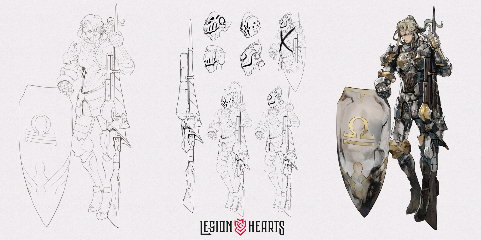
Composition and Sketches
We wanted to capture the chapter’s hook – a colony ship from another world causing unrest in a medieval kingdom – with the cover, and it’s composed of the following three parts accordingly:
- Ilia in full armor (minus her helmet)
- A wreck of a modern tank on the ground below
- A modern airship in the sky above
Unlike her character design which shows her being regretful, we also wanted Ilia to be defiant and full of determination on the cover to show her progression over the course of the story.
These initial sketches illustrated the crop options and helped us decide on a pose, as well as Ilia’s expression. While all future chapter covers will follow this format and feature the protagonist front and center, the details will naturally differ to fit the respective story and themes. Stay tuned!
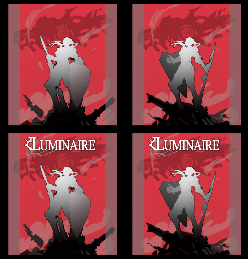
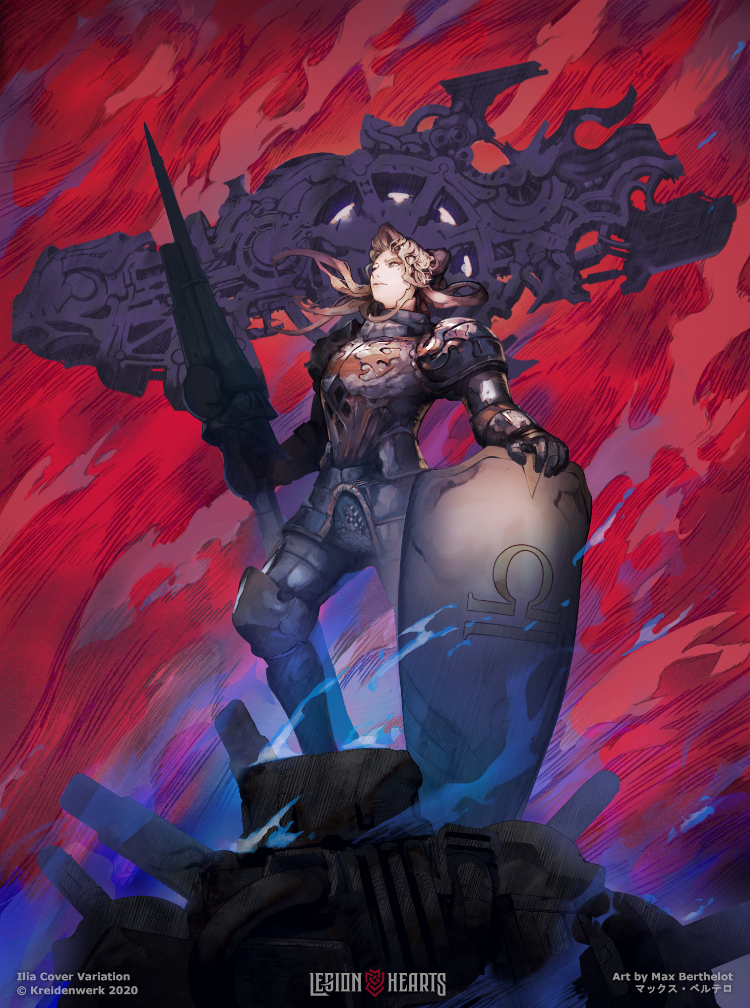
Color Variations
Next up was trying out a few color variations and experimenting with the cover’s tone. While we preferred Zangeki no Reginleiv’s bold red color, we wanted to see if other color combinations worked as well.
 |  |  |
Yellow didn’t work at all, but we liked the option of having a less aggressive variation and moved forward with Red and Blue. From here, Max added two additional color variations to the mix and began to finalize the piece.
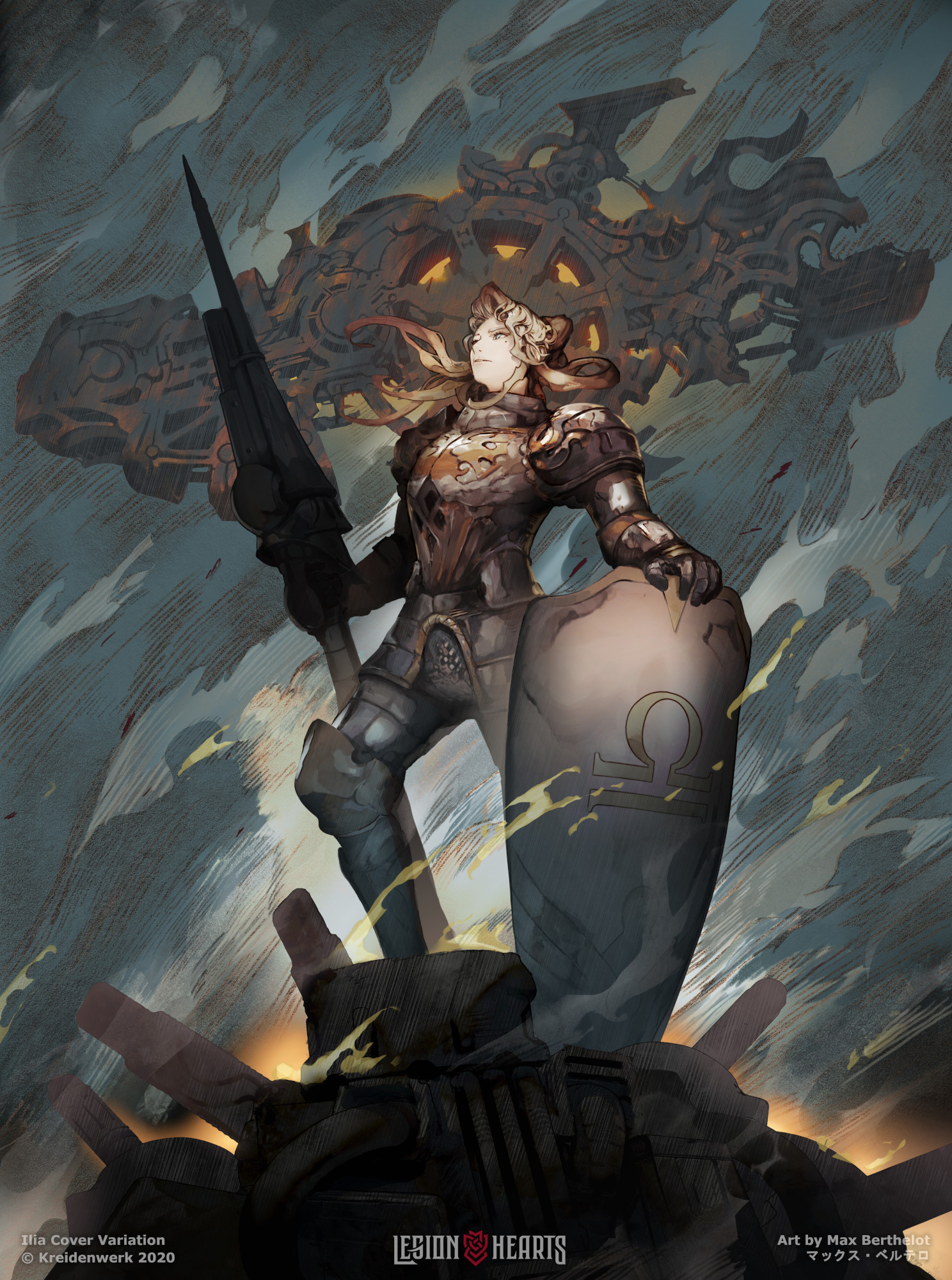
During the process, the initial idea of Ilia standing on a knocked out tank fell out of favor: Showing that much detail at the bottom took away focus from Ilia’s face and made it difficult to place the logo as the background would be too bright and detailed.
 |  |
In the end, the airship already conveyed the oddity of a knight coming into contact with advanced technology, so we went with a nondescript rubble pile instead.
Final Cover Set
The last step was adding detail to the background, which gives the cover its distinct visual texture. Max also created a Crimson and Grey variation, giving us a total of 4 versions to choose from.
Ultimately, the primary goal of box art is for people to pick up the game in a retail store and read the description on the back. This hasn’t changed with the advent of digital storefronts such as Steam, where a tiny game thumbnail has to stand out enough for people to click on it.
 |  |
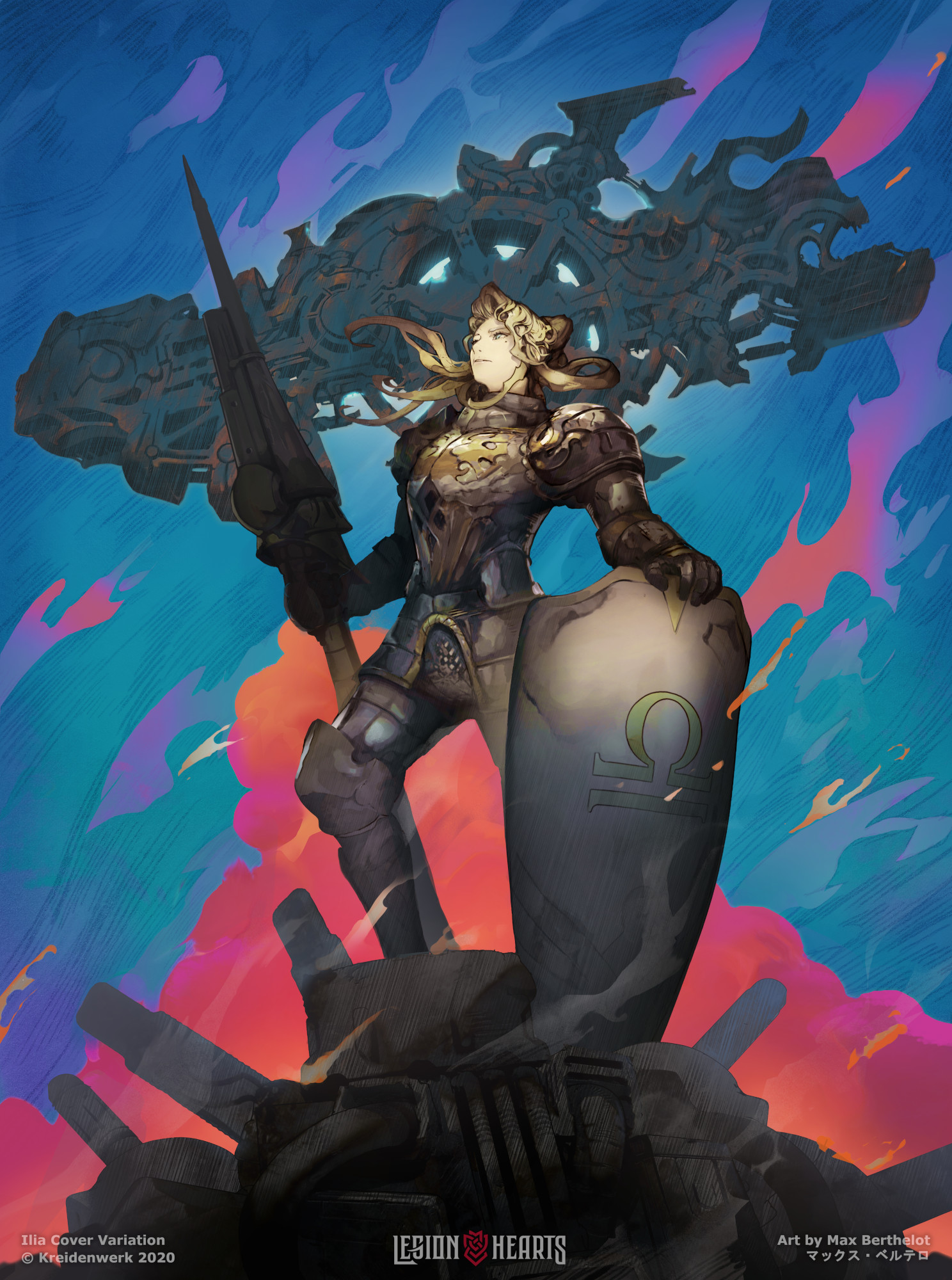 |  |
To help us choose, we showed these 4 images without context to some of our coworkers. The results were interesting: Crimson was the most eye catching at thumbnail size while Grey was the favorites when enlarged, so that’s the combination we ended up choosing. What do you think? We’ll begin including polls like these in our newsletter moving forward to get your feedback directly, so consider subscribing if you haven’t already!

---------
About Legion Hearts
Legion Hearts is a strategy RPG currently in development, and our first demo is scheduled for later this summer. If you want to be the first to play, keep an eye on our updates to get the details!
Comments
Log in with itch.io to leave a comment.
Hey there,
I just want to say I love these devlogs you’re doing! It really shows the creative process and planning of how things came to be.
Love the documentation on this post. Shows the references and inspirations and gradually shows the artwork becoming finalized. But not only the path of the final but the variations you’ve tried along the way with short notes on why you decided what.
Also read the logo devlog. It’s pretty crazy that your logo designer, Nina, decided to draw by hand the different drafts. Did you ever ask her why? Logo looks great and I can’t wait to see what the ingame UI menus and buttons look like!
I really hope you continue these devlogs and cover more areas of the game; like music, characters, story (might have spoilers so maybe not haha), design, concept art, etc. But yeah, I just wanted to say this since I didn’t see any other comments here and wanted to let you know there’s at least someone appreciating these devlogs!
I wish you and your team the best on development!