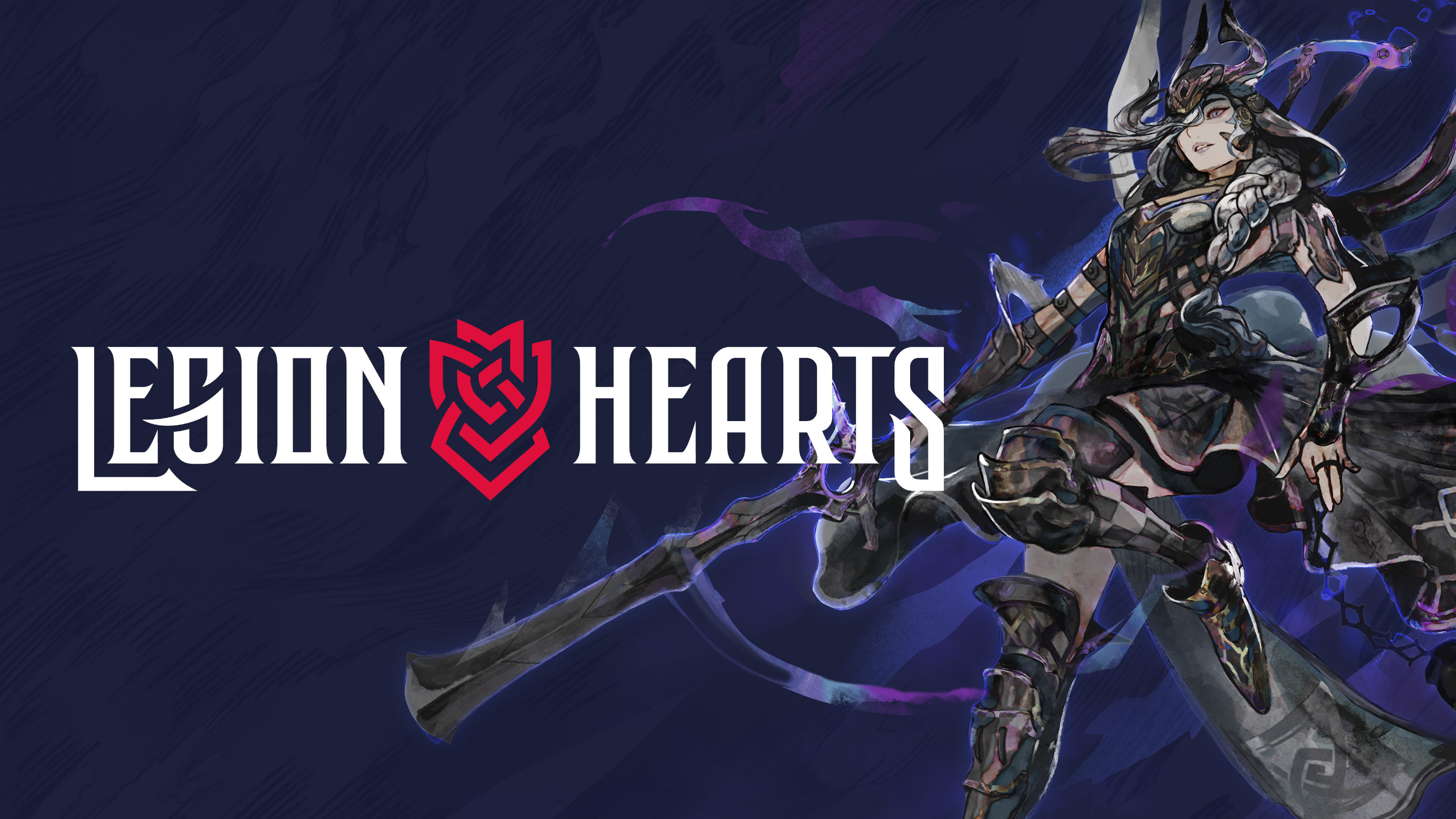
Legion Hearts
Making a Game Logo
Naming Legion Hearts
This project first started out as a retro JRPG stemming from an RPG Maker prototype in 2013 aptly titled “Project Luminaire” – a reference to a character ability in Chrono Trigger. We're still very fond of the name all these years later, but neither a matching domain nor suitable social handles were available for it, so it was time to find a new one.
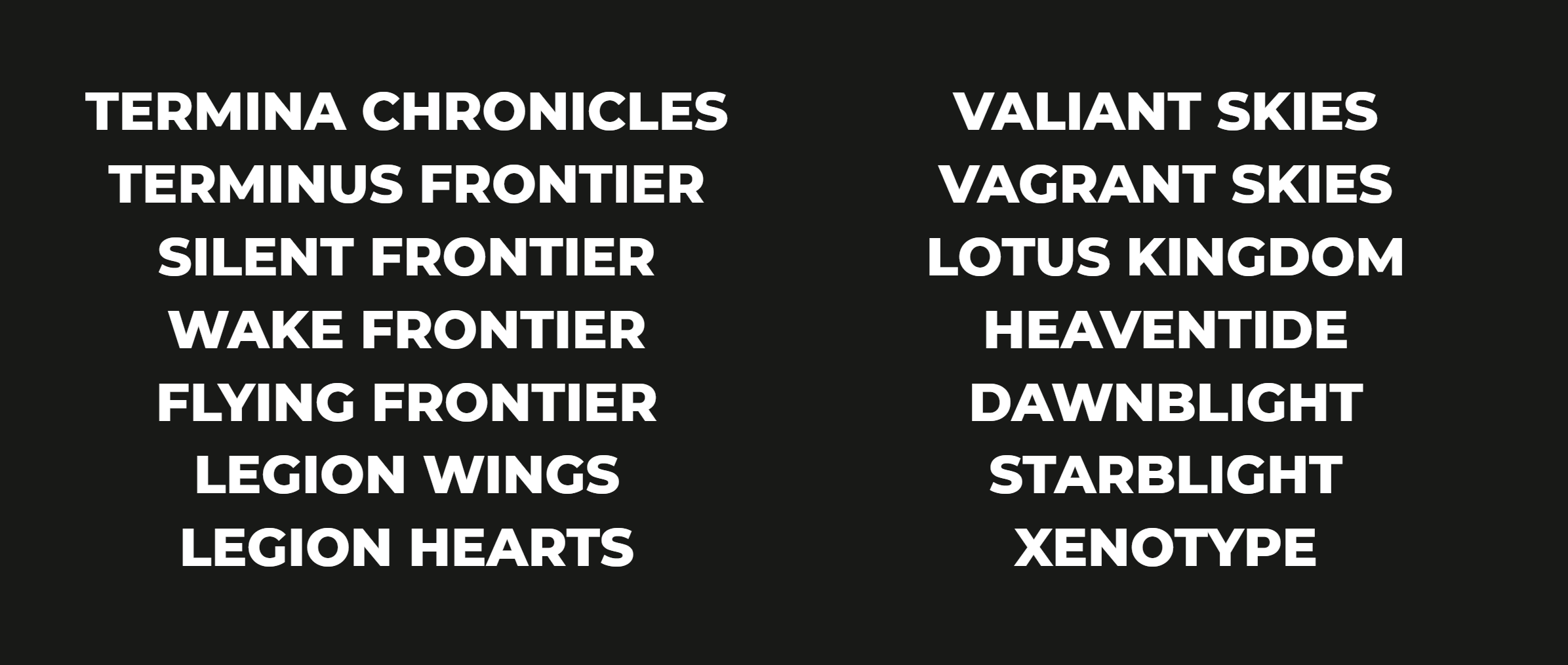
First, we selected a neutral control font and proceeded to write down anything and everything that came to mind and was available to some extent. Then we gradually filtered out the names we liked the least until we were down to the following three:
- Vagrant Skies (Referring to the changing sky above the main heroes as they travel across Yggdrasil)
- Lotus Kingdom (Referring to Yggdrasil’s eternal cycle of death and resurrection)
- Legion Hearts (Referring to the many different souls that players will recruit and fight alongside during Ragnarok)
Vagrant Skies fell out of favor rather quickly because it’s such an abstract concept to visualize with an icon and it felt weird to actually say out loud. Lotus Kingdom turned out to be the name of an obscure casino game that could have potentially caused issues, so we settled with Legion Hearts.
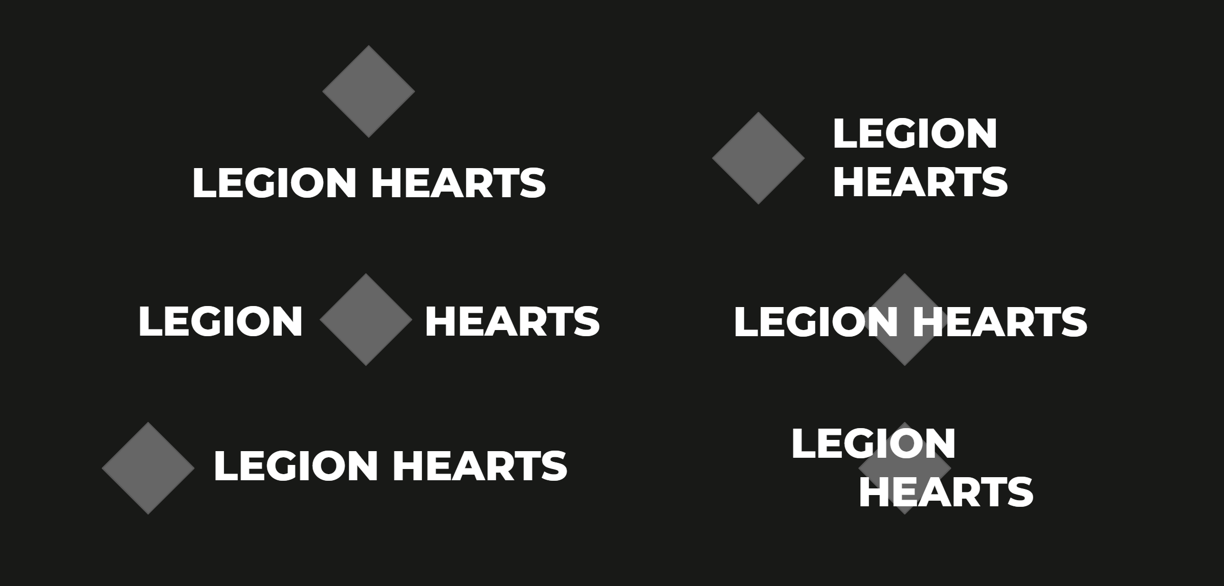
As for the style itself, we decided to go with a combination mark rather early on as it’s really versatile when used on the web. A combination mark is a logo comprised of an icon and type – take No Man’s Sky’s logo as an example. While we didn’t have a precise design in mind, we wanted something minimal using a white font without an outline.
Making the Logo
Next up was finding a professional to actually create the logo. Unfortunately, you can’t just search for “Video Game Logo Designers” as that’s too much of a niche, but Graphic Designers and UI/UX Designers often do logo designs as well. And that’s how we found Nina Pykhtina, the creator of Legion Hearts’ logo.
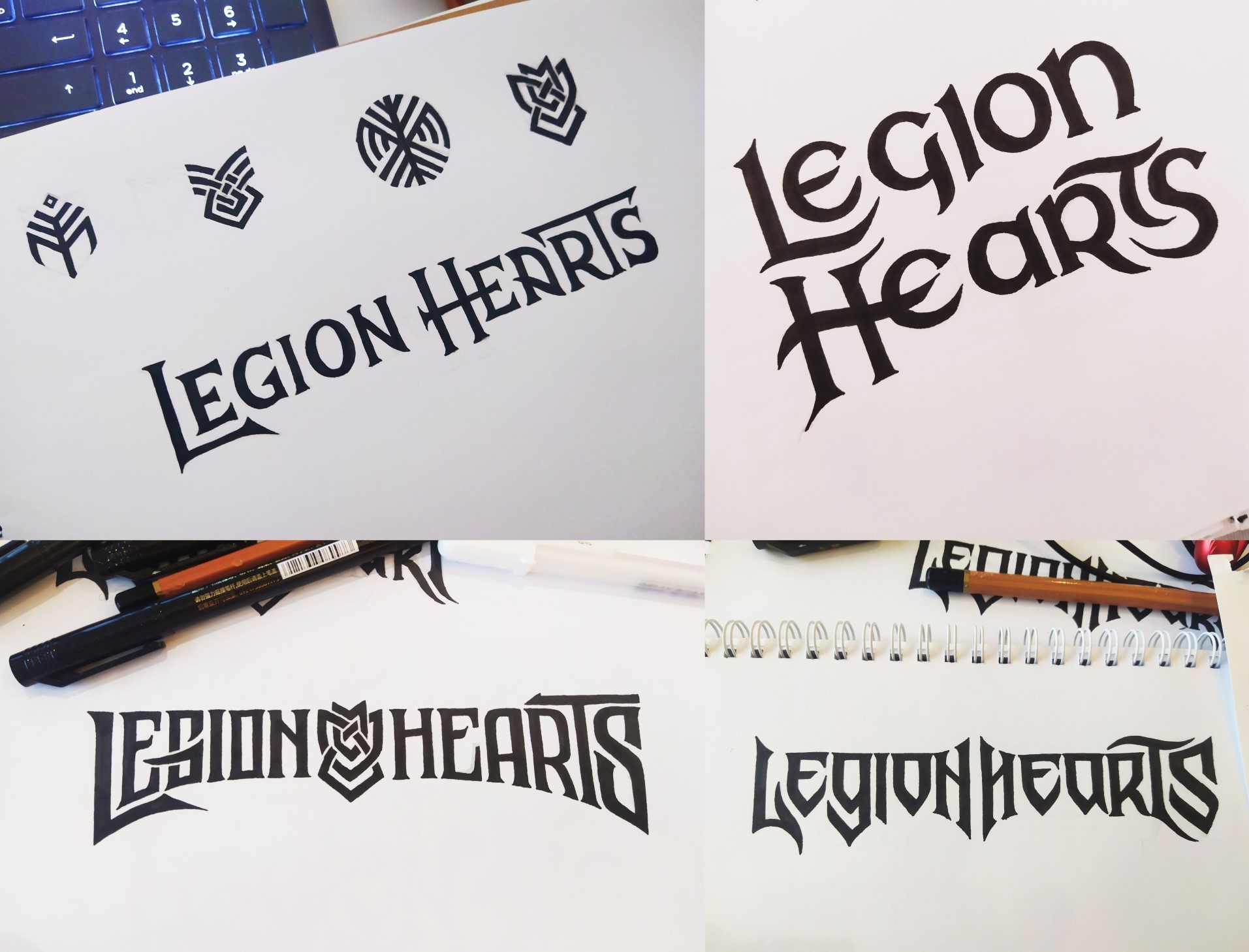
Nina drew the sketches during exploration by hand which was a rather time consuming process, but the resulting fonts were truly unique while remaining very legible. Potential themes for the icon were Yggdrasil, infinity, and becoming one to reflect the meaning behind the names we covered earlier. Once we settled with a font, the design was put into vector to make further adjustments.
Quick graphic design 101: Unlike pixel graphics, vector graphics aren’t composed of individual picture elements – instead they’re made up of geometric primitives like lines, circles, or curves. The vector graphic’s saved parameters can then be recalculated to fit new sizes, meaning images can be scaled up and down without any losses to quality. It also eats less of your RAM.
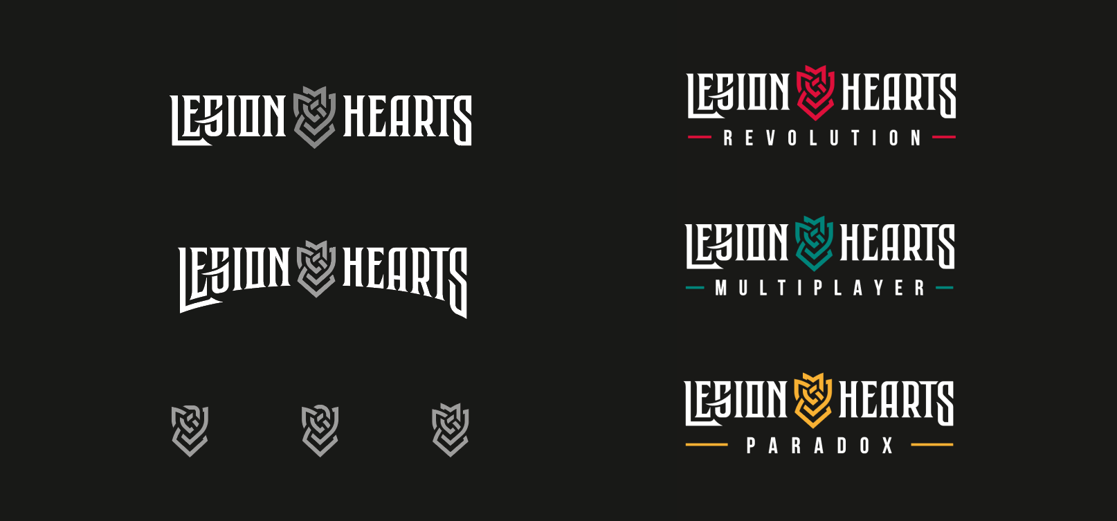
Since Legion Hearts will be released in chapters, the logo will go on several covers along with the respective subtitle. The precise design of these logo variations is still subject to change, but the goal here was to create a solid base logo to work from.
The icon we chose was inspired by Celtic patterns, and Nina describes it as a shield representing infinity as separate things intertwine and become one. Aesthetically, it reminded us a bit of a rose so we tried out a reddish color to amplify the look. The text itself is kept black and white so the logo doesn't clash with the artwork it sits on.

And that’s the making of our logo! We are so looking forward to printing this on a game case one day. If you want to see more of Nina’s work, check out her portfolio on Behance.
--------------------
About Legion Hearts
Legion Hearts is a strategy RPG currently in development, and our first demo is scheduled for later this summer. If you want to be the first to play, keep an eye on our updates to get the details!
Leave a comment
Log in with itch.io to leave a comment.